Paying off Design Debt

Shipped August 2023

Summary

Led discovery (workshops, goal setting, and prioritization), directed, and implemented a design refresh of key experiences within Samaritan’s Member Dashboard.

Overview

The Samaritan Dashboard faithfully serves 80,000+ households, allowing members to manage their membership online to send their monthly Share, upload and manage medical bills, and stay up to date with their membership.

The Problem

  • The Samaritan Dashboard had significant design debt that had accumulated over years of rapid design and development.

  • Our Design System was built “as the plane was flying”, so each of our 20+ web apps ended up using various versions of our Design System (some even predating our design system), resulting in visual inconsistencies and a lack of professionalism in presentation.

Additional Complexities

Additional Complexities

  • Due to constraints in scope, we intentionally avoided addressing complex UX Design debt. We needed to operate quickly and stay within the time-boxed period of the refactoring project. For this body of work, we focused solely on addressing visual design debt, resolving UI “paper cuts” and addressing visual inconsistencies within the experience.

  • We lacked the ability to capture meaningful analytics within our platform. Due to the nature in which the system was built, we didn’t have any visibility into event actions aside from what Google Analytics could give us “out of the box” to understand how our product was being used at the time.

Discovery

Auditing the Current Experience

Before work was done to resolve any issues, it was vital that the team understood the current experience – only then could we have appropriate context for the severity of the problems that existed. I led a Design Team of 4 through an activity to review and assess experiences within the app. We then shared our findings at the beginning of the first workshop so that each team member came in with the same knowledge and understanding of the current experience.

During this time it was important that we cast the furthest net we could and capture everything possible so that we weren’t letting opinions direct what problems we focused on. Later, we would work to pair these items down and allow the biggest issues to naturally filter to the top. 

During this time it was important that we cast the furthest net we could and capture everything possible so that we weren’t letting opinions direct what problems we focused on. Later, we would work to pair these items down and allow the biggest issues to naturally filter to the top. 

Workshop Insights

Workshop Insights

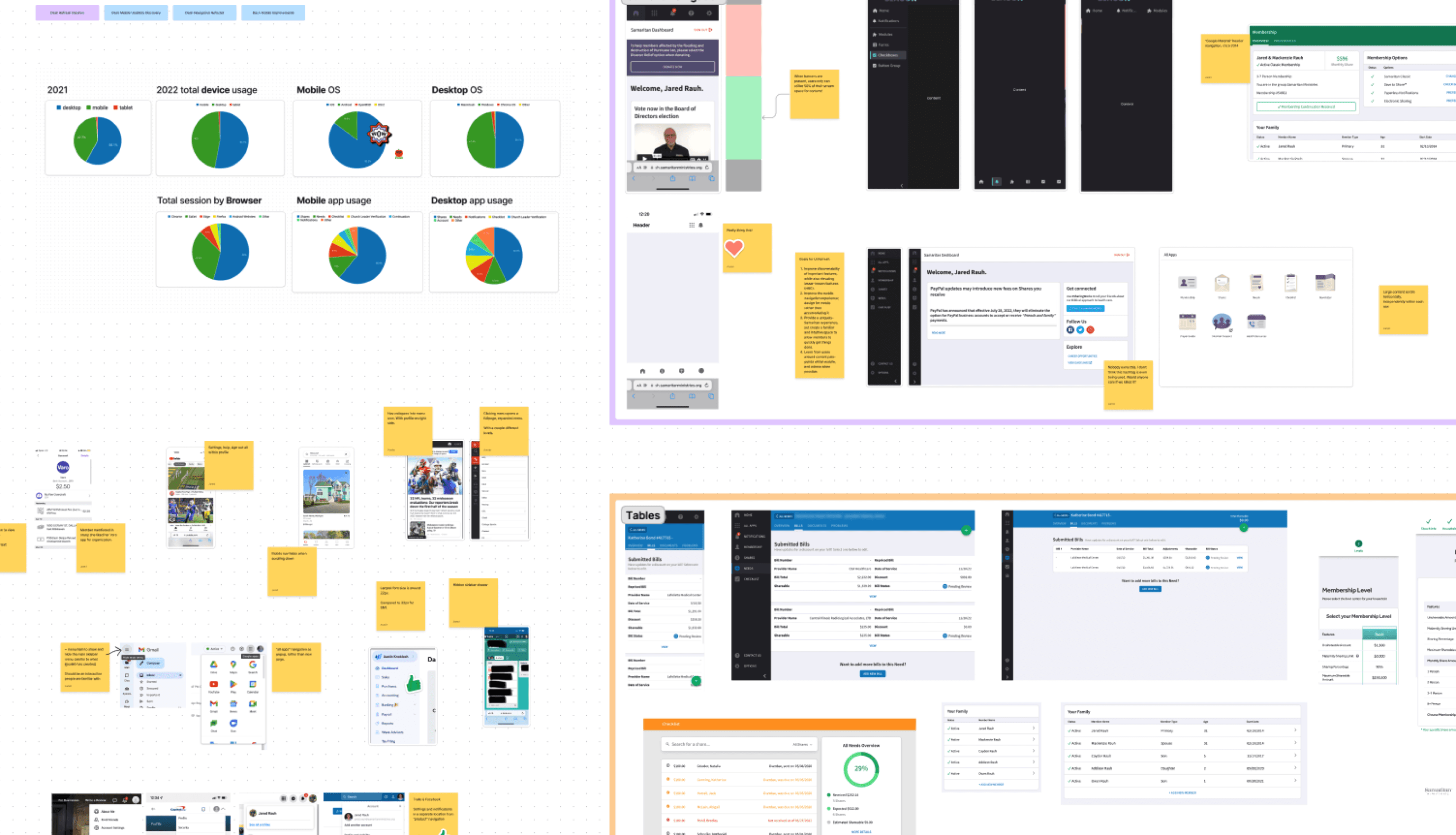
To identify and prioritize where we would place our focus, I led the team through a series of workshop activities to identify, prioritize, and formalize the work:

  1. We first came together as a team to review the audited experiences and created an affinity map of each area. We reviewed known data about the current experience, pulling from previous user research, data analytics, and surveys.

  2. We then individually dot-voted on items that we believed fell within the scope of “visual design debt” to quickly promote those ideas that would provide value, and weed out those that could distract from our goal.

  3. From there we pulled those items into a matrix comparing impact and effort, and brought in team members from Product and Development to provide additional insights.

  4. The next day, we came back together and presented a lightning demo of a competitive analysis, highlighting ways that other applications have solved similar problems in the past.

User Research

While we lacked strong quantitative insights into how users’ behaved within our Dashboard, we gained clarity on direction through a few additional research efforts:

  1. We launched an new initiative simply called “Continuous Discovery Research” (inspired by Teresa Torres’ book Continuous Discovery Habits), where our team prioritized monthly 1:1 interviews with members to understand current pain points within the Dashboard experience. Through this effort we gained a better understanding about some discoverability issues with various features within the Dashboard.We then individually dot-voted on items that we believed fell within the scope of “visual design debt” to quickly promote those ideas that would provide value, and weed out those that could distract from our goal.

  2. We partnered with our Member Experience team to deliver a survey to our membership. Through this we gained actionable insights into various metrics around Dashboard usability, visual appearance, and ease-of-use. The next day, we came back together and presented a lightning demo of a competitive analysis, highlighting ways that other applications have solved similar problems in the past.

  3. We performed secondary research on many of our previous studies, identifying opportunities for visual improvement from user feedback and research recommendations that hadn’t yet been resolved.

Opportunities

1

1

1

Improve discoverability of important workflows, while elevating valuable, yet lesser-known features.

Improve discoverability of important workflows, while elevating valuable, yet lesser-known features.

Improve discoverability of important workflows, while elevating valuable, yet lesser-known features.

The Dashboard’s primary navigation and information architecture was outdated and had some core usability concerns that needed addressed. Secondary features were buried under an “all apps” page that made access hidden and lead to under-utilization of valuable cost-saving features.

2

2

2

Design for mobile, rather than accommodate it through responsive design.

Design for mobile, rather than accommodate it through responsive design.

Design for mobile, rather than accommodate it through responsive design.

Since the inception of the Dashboard, our approach has been to provide self-service tooling that allow members to get in, get their task done, and get out. Often times, members dealing with complex workflows such has uploading and managing medical bills prefer to deal with that type of information through a laptop device, however through user research (data analytics, user interviews) we identified a growing trend of more users choosing to engage with quick tasks such as sending their monthly Share or viewing their membership status from their mobile device.

3

3

3

Provide a uniquely Samaritan experience while creating a familiar and intuitive space to quickly get things done.

Provide a uniquely Samaritan experience while creating a familiar and intuitive space to quickly get things done.

Provide a uniquely Samaritan experience while creating a familiar and intuitive space to quickly get things done.

Our Creative Services department had recently pushed out a brand refresh that wasn’t fully adopted within the Dashboard experience. Our design system had adopted core brand colors, however our typography and illustration style was inconsistent and outdated. Through this refresh we had an opportunities to blur the lines between our departments and present the member Dashboard experience in a way that felt more consistent with the visual design of our marketing website.

Bonus Opportunity!

+1

+1

+1

Introduce robust analytics tooling

Introduce robust analytics tooling

Introduce robust analytics tooling

While addressing design debt in parallel with technical debt, we had the opportunity to implement better analytics tooling within this work, which would allow for our teams and ministry leadership to have better visibility into how our system was being utilized. I spearheaded this initiative, in partnership with Software leadership, to build a business case and evaluate potential solutions for our teams.

Solution & Implementation

1

Navigation Improvements
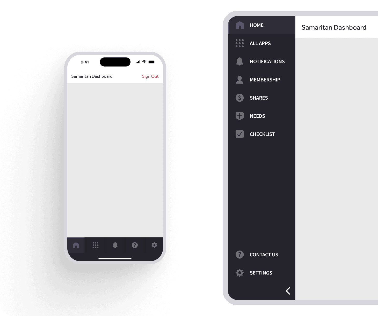
Our team created mood boards, worked through dozens of solutions and iterations, and facilitated usability testing to deliver an experience that was familiar, yet allowed for greater usability across the mobile and web experience. Below are a few highlights from the change.

  • Removed the “All Apps” page on the web app and place additional resources within the sidebar, resulting in a greater utilization of tools such as our Health Resources feature.

  • Improved mobile usability by placing most frequently used features within the bottom navigation, and included labels to aide in recognition and recall.

  • Incorporated Samaritan brand colors through the use of Design Tokens that could be used consistently across platforms and projects.

Previous experience

Refreshed design

Increased Discoverability

Increased Discoverability

Increased Discoverability

We achieved our objective to increase discoverability of lesser-known tools by making them directly available to users through the Dashboard’s sidebar (and one quick tap away through the mobile menu), while simultaneously providing quicker access to key experiences such as Shares and Needs. This effort lead to a 30% increase in user engagement with our Health Resources tool, which offers cost-saving solutions to medical procedures, prescription discounts, and more.

We achieved our objective to increase discoverability of lesser-known tools by making them directly available to users through the Dashboard’s sidebar (and one quick tap away through the mobile menu), while simultaneously providing quicker access to key experiences such as Shares and Needs. This effort lead to a 30% increase in user engagement with our Health Resources tool, which offers cost-saving solutions to medical procedures, prescription discounts, and more.

We achieved our objective to increase discoverability of lesser-known tools by making them directly available to users through the Dashboard’s sidebar (and one quick tap away through the mobile menu), while simultaneously providing quicker access to key experiences such as Shares and Needs. This effort lead to a 30% increase in user engagement with our Health Resources tool, which offers cost-saving solutions to medical procedures, prescription discounts, and more.

Impact of user engagement of Health Resources tool before and after navigation update

Impact of user engagement of Health Resources tool before and after navigation update

2

Refreshing the Mobile Experience

I led design efforts to improve mobile interactions, aiming to shift our design approach from accounting for the mobile experience through responsive design to building for mobile.

One interface element that had the greatest reach and impact on our membership was refactoring our mobile table interface.

Design and code updates where made to tables that displayed core features such as membership settings, bills lists, and the member checklist.

Design and code updates where made to tables that displayed core features such as membership settings, bills lists, and the member checklist.

Evaluation and Implementation

  • I evaluated the current design through a heuristic review, identifying usability issues with consistency & standards, flexibility & efficiency of use, and aesthetic design.

  • I then created a mood board of other mobile table interfaces, citing common interface elements and trends when displaying complex data

  • After working through iterations on layout and incorporating feedback from the team through design critique, I formalized these changes through code adjustments to the bills list experience.

  • After these changes were implemented, a squad implemented the remaining changes to our Design System and additional app experiences.

We achieved our objective to increase discoverability of lesser-known tools by making them directly available to users through the Dashboard’s sidebar (and one quick tap away through the mobile menu), while simultaneously providing quicker access to key experiences such as Shares and Needs. This effort lead to a 30% increase in user engagement with our Health Resources tool, which offers cost-saving solutions to medical procedures, prescription discounts, and more.

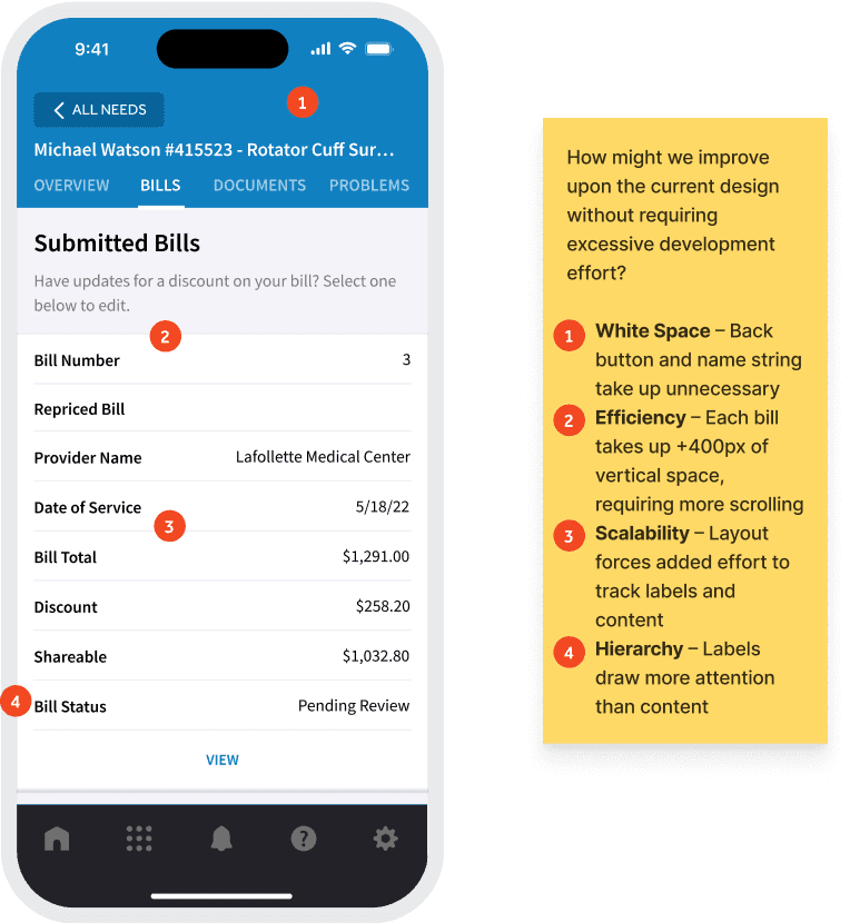
Auditing the current experience and prioritizing improvements

Iterating on table solutions for the bills list experience

Components created for reuse

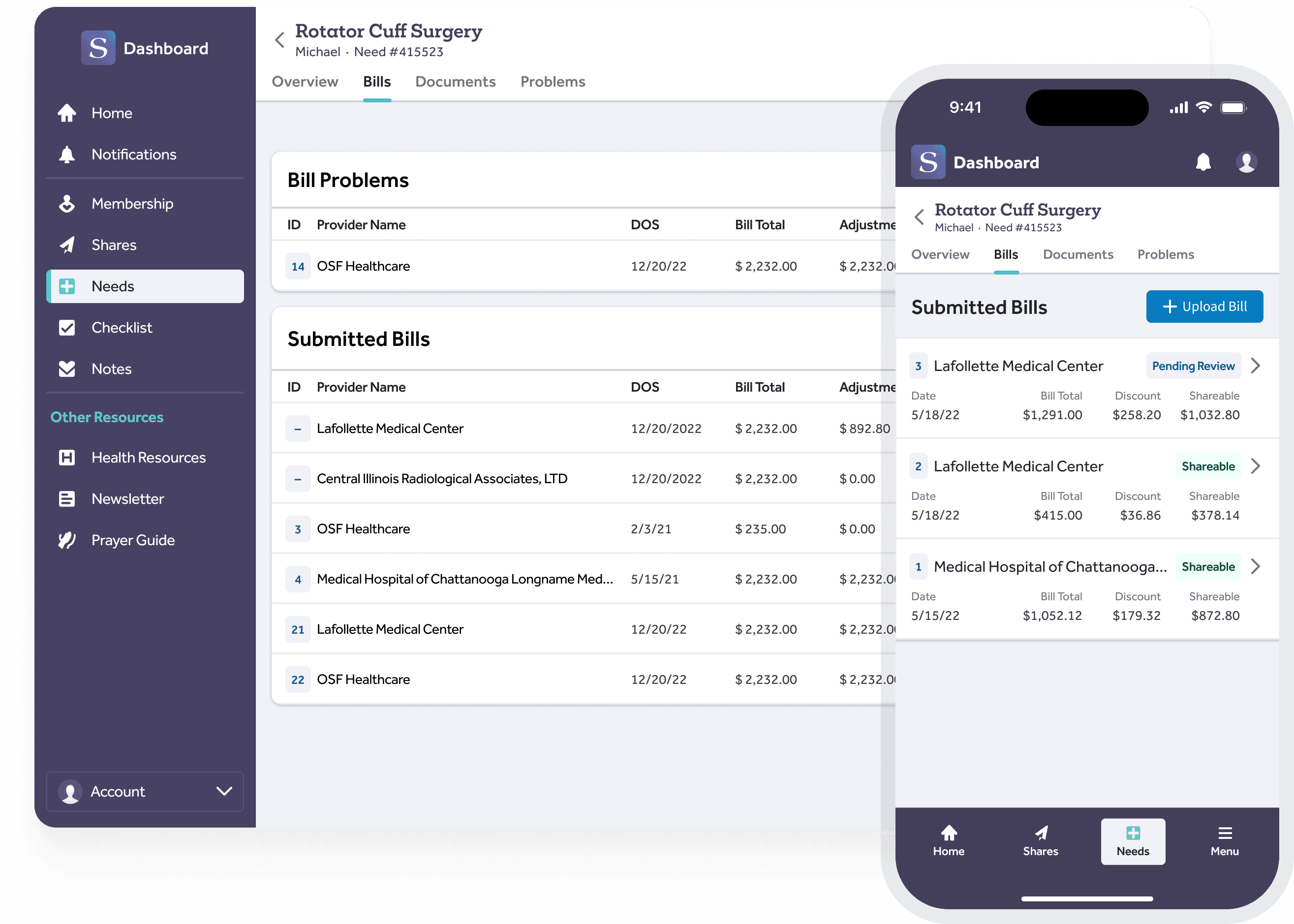
Responsive for mobile and web

3

Delivering a Consistent Brand Interface

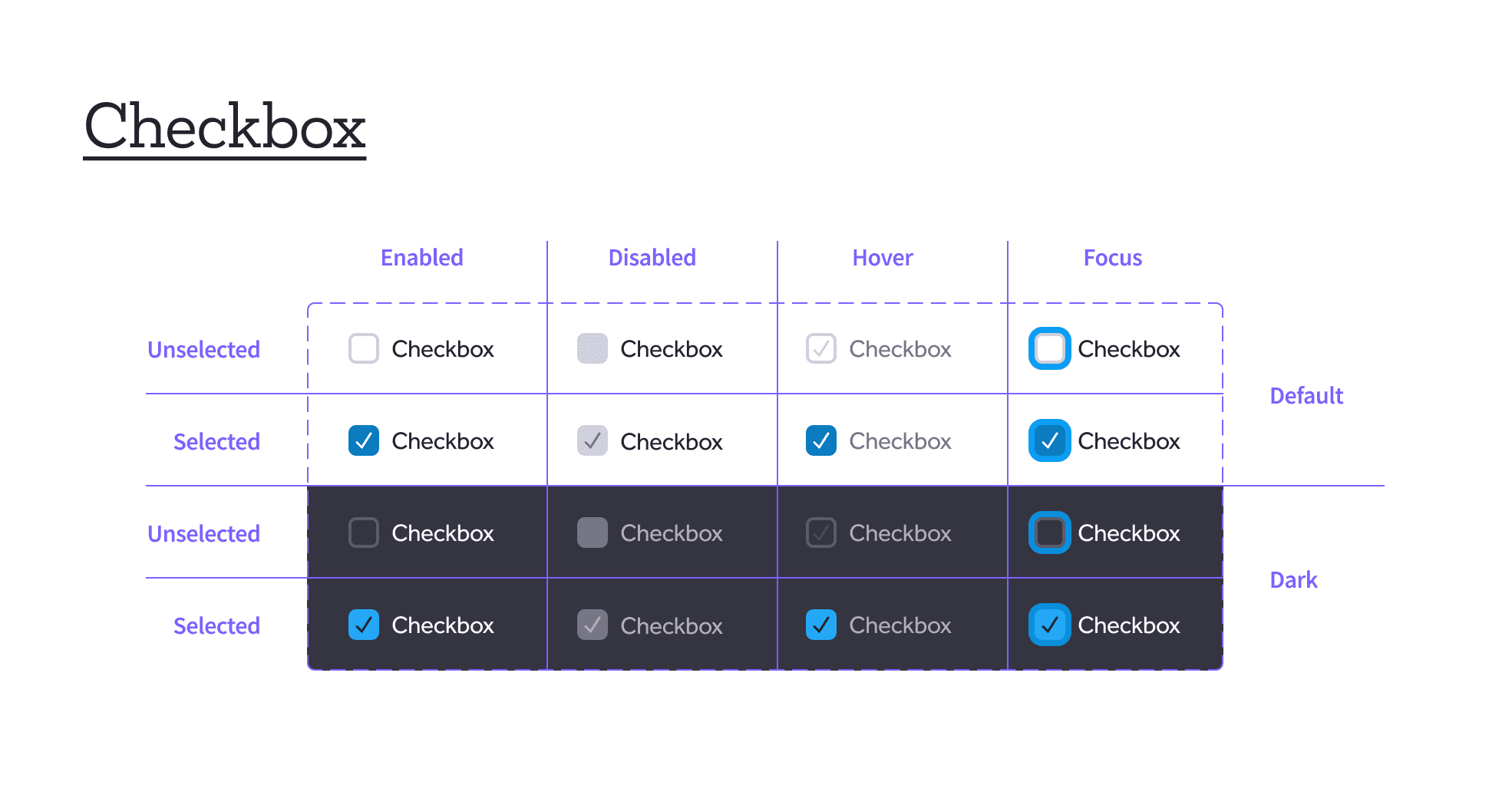
An important part of our efforts to address Design Debt was the enhancement of the visual branding across the Member Dashboard. This initiative was a collaborative endeavor with our Creative Services team, aimed at refreshing the Dashboard's visual identity to provide a uniquely Samaritan experience while maintaining a familiar and intuitive interface.

Illustration Refresh

We rejuvenated the Dashboard's visual appearance by updating our use of illustration. This effort ensured that our imagery aligned more closely with our brand's values and messaging, enhancing the overall user experience.

We achieved our objective to increase discoverability of lesser-known tools by making them directly available to users through the Dashboard’s sidebar (and one quick tap away through the mobile menu), while simultaneously providing quicker access to key experiences such as Shares and Needs. This effort lead to a 30% increase in user engagement with our Health Resources tool, which offers cost-saving solutions to medical procedures, prescription discounts, and more.

Typography

We updated the use of typography throughout the Dashboard. This change aimed to improve readability and ensure consistency in the visual hierarchy, further aligning the Dashboard's design with our brand standards.

We achieved our objective to increase discoverability of lesser-known tools by making them directly available to users through the Dashboard’s sidebar (and one quick tap away through the mobile menu), while simultaneously providing quicker access to key experiences such as Shares and Needs. This effort lead to a 30% increase in user engagement with our Health Resources tool, which offers cost-saving solutions to medical procedures, prescription discounts, and more.

Color Scale Update

A significant aspect of our branding update involved revising our color scales. While the palette didn't change significantly, the structure in which we made the use of color available within our Design System did. We rolled out a new Design Token driven approach, which represented a strategic move towards a more accessible and maintainable system.

We achieved our objective to increase discoverability of lesser-known tools by making them directly available to users through the Dashboard’s sidebar (and one quick tap away through the mobile menu), while simultaneously providing quicker access to key experiences such as Shares and Needs. This effort lead to a 30% increase in user engagement with our Health Resources tool, which offers cost-saving solutions to medical procedures, prescription discounts, and more.

The refreshed color scale incorporated our current brand colors while also smoothing the transition between values.

The refreshed color scale incorporated our current brand colors while also smoothing the transition between values.

Figma became our source of truth for color styles, which was delivered as a design token and made available to a variety of products and use-cases

Figma became our source of truth for color styles, which was delivered as a design token and made available to a variety of products and use-cases

Dark Mode

While the implementation of a dark mode theme was not within the scope of this project, the updates made through the design token work positioned our team to be able to support dark mode in the future.

We achieved our objective to increase discoverability of lesser-known tools by making them directly available to users through the Dashboard’s sidebar (and one quick tap away through the mobile menu), while simultaneously providing quicker access to key experiences such as Shares and Needs. This effort lead to a 30% increase in user engagement with our Health Resources tool, which offers cost-saving solutions to medical procedures, prescription discounts, and more.

Impact of user engagement of Health Resources tool before and after navigation update

Impact of user engagement of Health Resources tool before and after navigation update

These enhancements contributed to a more consistent and branded interface, reinforcing the Samaritan identity while continuing to provide a usable and intuitive experience for our members. This alignment between visual branding and user interface design not only addressed current design debt but also established a solid foundation for future innovations and updates.

We achieved our objective to increase discoverability of lesser-known tools by making them directly available to users through the Dashboard’s sidebar (and one quick tap away through the mobile menu), while simultaneously providing quicker access to key experiences such as Shares and Needs. This effort lead to a 30% increase in user engagement with our Health Resources tool, which offers cost-saving solutions to medical procedures, prescription discounts, and more.

Measuring Impact

Evaluating Usability

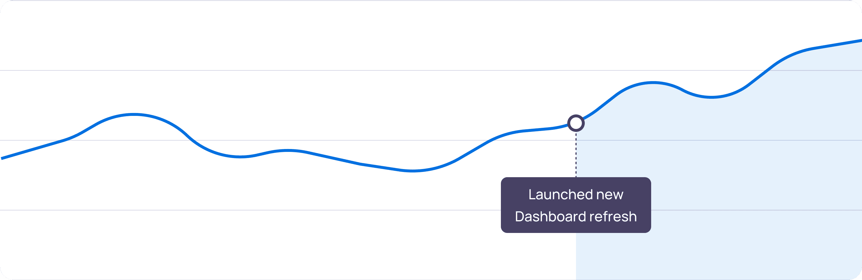
Prior to releasing the UI refresh, it was important that our team was able to measure the impact of our changes. While we had collected qualitative metrics through in-depth interviews and user feedback to inform the problems to be solved, we wanted to utilize an opportunity to begin to benchmark the perceived usability of our platform experience. To do this, we launched a SUPR-Q survey to a representative sample of our membership to begin to capture this data.

The Standardized User Experience Percentile Rank Questionnaire (SUPR-Q) is an 8-item questionnaire used to measure the quality of a website’s user experience. This survey provides a quality metric for Usability, Appearance, Trust & Credibility, and Loyalty. We gathered an initial benchmark in August of 2023, then launched a follow-up survey in March of 2024.

The initial benchmark provided meaningful insights and aligned with the previous Member Experience survey, confirming our suspicions that the Dashboard appearance could be improved. As of writing this case study, we have not yet analyzed the 2024 results to be able to report on future results.

+1

+1

+1

Launching a New Analytics Platform

Given the lack of visibility and clarity into our current platform analytics, I utilized this opportunity of refactoring to bring a new analytics solution to our platform. With the launch of the Dashboard refresh also came the launch of Posthog analytics, which offered a development-friendly solution not only to product analytics, but A/B testing and feature flagging, which have now become staples within our design and development process.

(For those looking for a robust solution to analyze, test, and deploy new features, I highly recommend this tool!)

Summary

Results

  • With the launch of the navigation refresh, we observed a 30% increase in user engagement with our Health Resources tool

  • We began benchmarking the perceived usability of our platform and gained favorable insights into our improvements. The survey was then adopted by Software leadership as a UX quality metric that measured every-other quarter.

  • This brought energy and excitement within the Design team, allowing us to collaborate around creative solutions as we invested in “quality of life” improvements for our members.

Much of the success of this effort is due in large part to the awesome teammates I partnered with along the way (Austin, Lindsay, Nick, Abby, Cameron).